Mars Veterinary Health

Removing the Invisible Wall from Wallet Management

100% Task Success Rate
78% Faster Task Completion
0% Drop-off Rate
Role UX Research · Visual Design · Interaction Design
Team Product Manager · Product Owner · Engineering Team
Duration Dec 2023 – Jul 2025
The Challenge

Mars Veterinary Health (MVH) operates a global network of partner hospitals. Their internal SaaS platform supports clinic staff in day-to-day operations. The product had been fast-tracked into production to meet business deadlines, leaving significant design and technical debt across multiple domains.

Veterinary Hospital Staff Were Blocked From Daily Financial Tasks

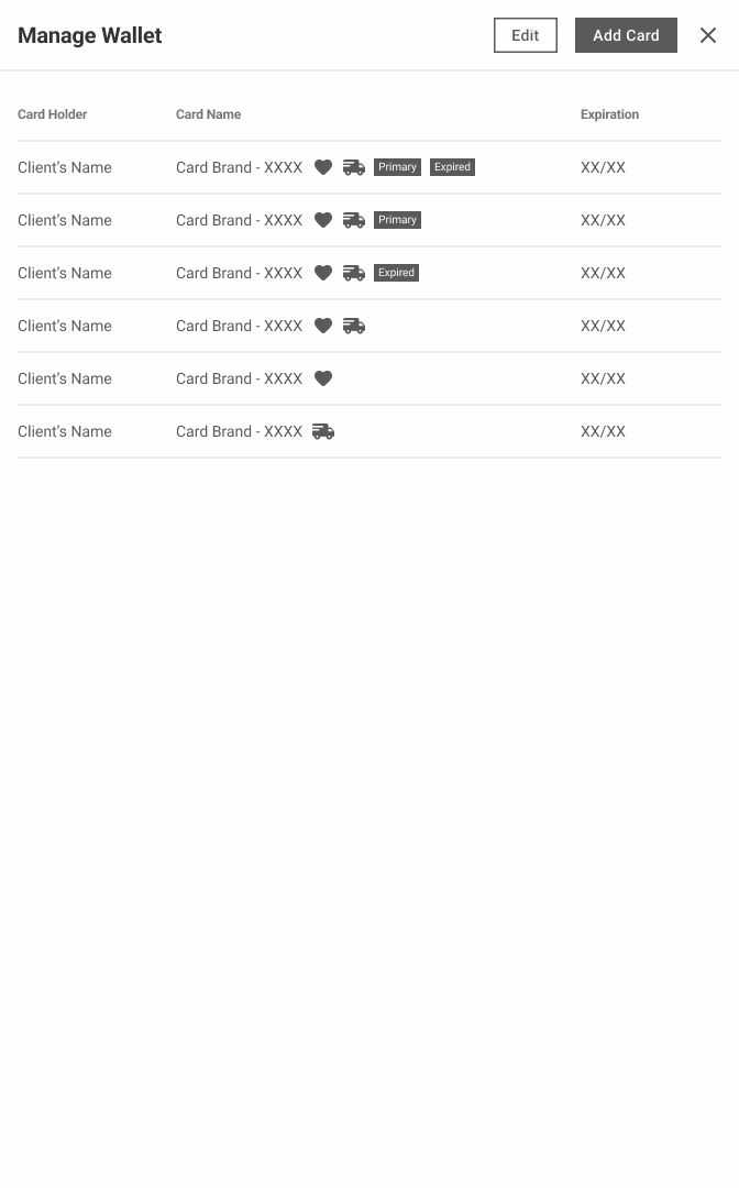
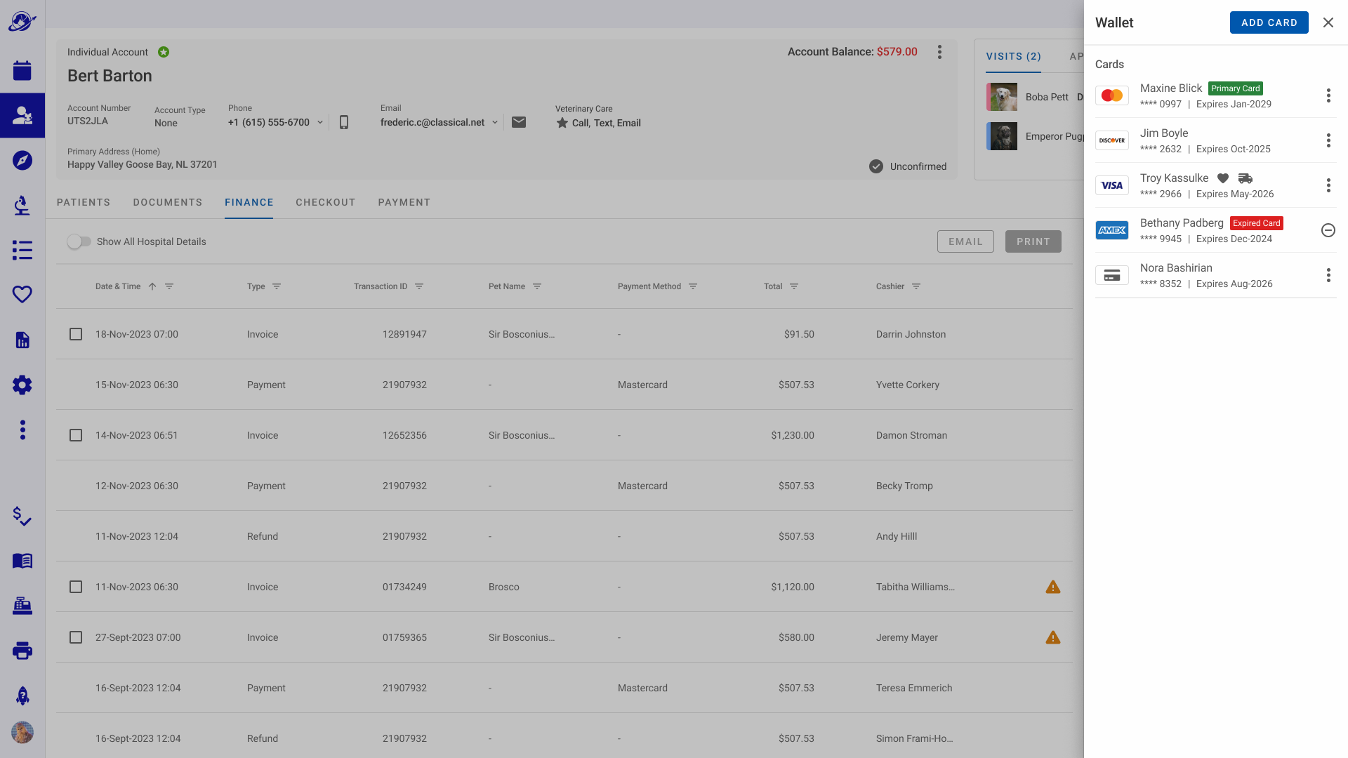
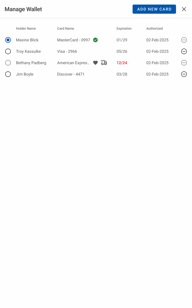
The existing payment settings screen showed a remove icon on each saved card. But for the primary card, that icon was disabled with no explanation. A green checkmark indicated primary status, but nothing labelled it as such.

This resulted in only 20% of users correctly identify their default card in the existing interface, and clients who needed to remove their primary card hit a wall.

Manage Wallet interface — before redesign
The Research

Understanding Real Pain Points Before Touching Designs

Before any design work began, I immersed myself in how hospital staff actually used the payment management flow. I chose three methods that would give me both qualitative depth and competitive context.

Stakeholder Interviews

The Finance team met with VCA's hospital staff and stakeholders to discuss the business objectives and user pain points. During these meetings, there was confusion around identifying the default payment card and the inability to remove it.

Usability Testing

I led user interviews to understand the implementation's time on task, drop-off rate, and success rate. Having clear metrics allowed me to understand the issue more clearly and synthesize that data to make informed design decisions.

Competitive Audit

I followed interviews with a competitive audit of 3 comparable payment interfaces. I analyzed how they handled default card states, card removal, and visual hierarchy. Documenting best practices to adopt and anti-patterns to avoid.

Usability Testing Exposed a 20% Success Rate on the Core Tasks

I ran a moderated usability study with 5 participants, asking each to remove their primary payment card. The task should have taken under a minute. Instead it averaged nearly five.

4m 38s

Avg. Time on Task

20%

Task Success Rate

60%

Drop-off Rate

Disabled state, no feedback

The remove icon was visible but non-functional. Users tapped it repeatedly with no response — no tooltip, no error, no guidance.

Green check ≠ "Primary"

The primary card indicator relied on a green checkmark with no label. Only 1 of 5 participants correctly identified it without guessing.

No path to workaround

Users had no way of knowing they could set a different card as primary. The testing indicated that users relied on independently reasoning this out.

Support escalation risk

3 of 5 participants either gave up entirely or expressed intent to contact support, a costly outcome for a self-serve flow.

The Process

Who are we Actually Designing For?

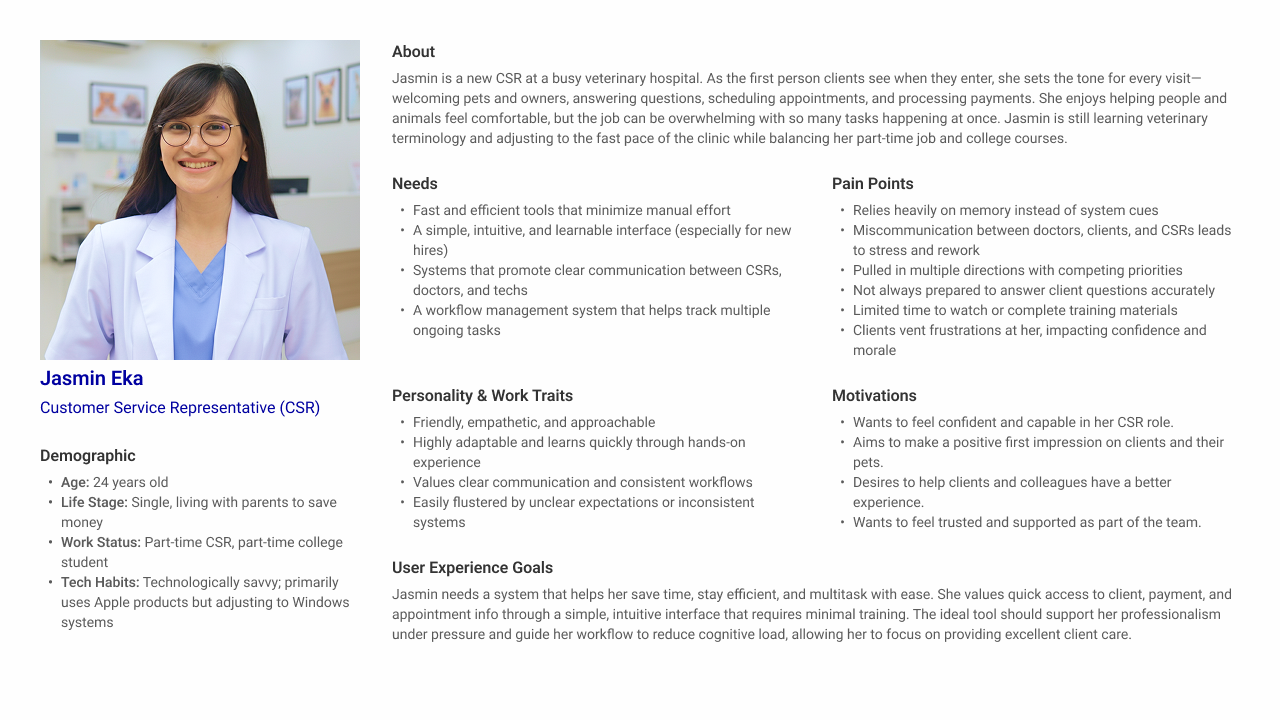
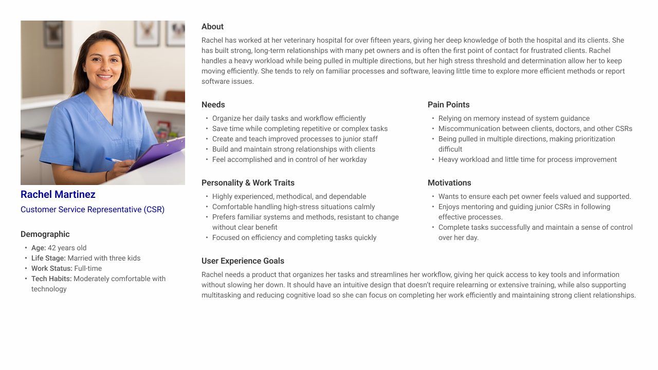
I identified four user personas: Junior CSR, Senior CSR, Veterinary Technician, and Doctor of Veterinary Medicine. Through analysis of the interview findings, both CSR roles emerged as the primary users.

They owned the payment management workflow day-to-day and bore the most friction from the current UI. This scoping decision shaped every design choice that followed.

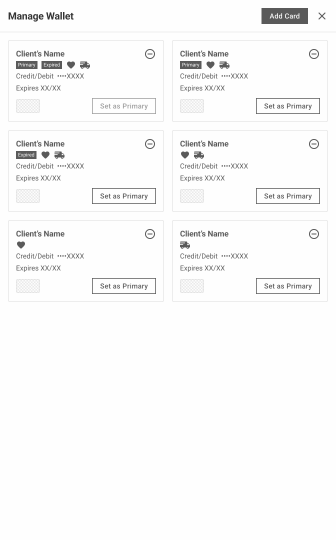
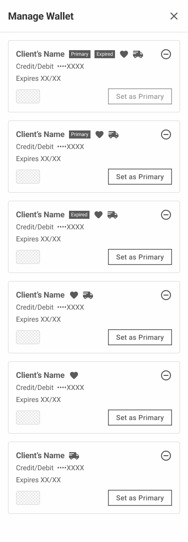
I made a deliberate decision to skip traditional wireframing and move directly into lo-fi layout explorations. Since we were redesigning an existing structure (not building from scratch), abstract wireframes would have been immediately discarded. Tight feedback loops with the Finance and Design teams allowed us to converge on direction quickly.

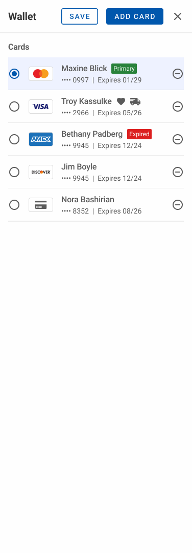
Wallet Edit Controls – View Mode
Wallet Kebab Menu Controls

Iterations Prior to Feedback and Testing

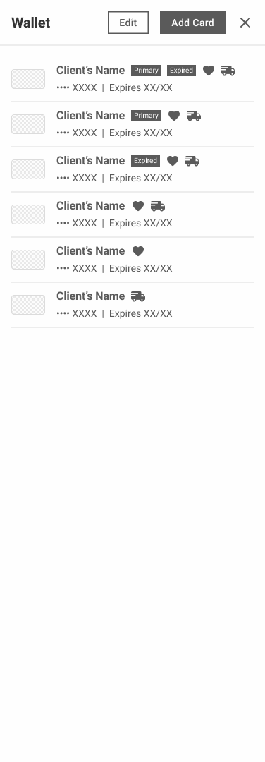
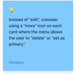
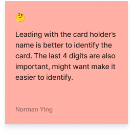
After the Finance team evaluated the layout variations for the Manage Wallet side sheet. We selected the most compact variants because larger options introduced unnecessary negative space without adding functional value. In addition, most clients held 1–3 cards at most, justifying the decision to proceed with the smaller side sheets.

View Mode

Wallet – View Mode

Edit Mode

Wallet – Edit Mode

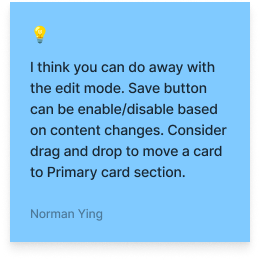
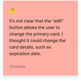
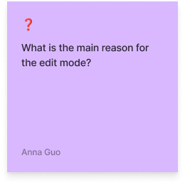
Prior to shipping, I verified my approach with the Design team to ensure accessibility standards and design system alignment. Valuable feedback was given and minor visual tweaks were made before shipping the final design.

The Solution

The Shipped Design Solution

01

Confirmation dialogue for card removal

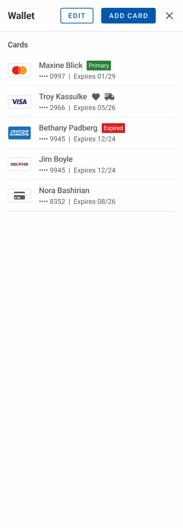
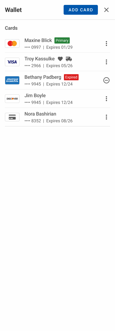
Unlike the previous implementation, the redesign allows direct removal of a primary card. A confirmation dialogue, stating the consequence, handles the safety concern without blocking the user entirely. Participant feedback confirmed this felt reassuring rather than obstructive.

02

Explicit "Primary" label

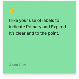
The green checkmark was removed in favor of a "Primary" label. This single change eliminated the identification failure seen in 1 of 5 participants. All participants in testing identified the card immediately without hesitation.

03

Kebab menu replacing the remove icon

A three-dot overflow menu consolidated two actions: "Set as primary" and "Remove card." This replaced the context-dependent disabled state with a standard, discoverable affordance.

Before redesign — original Manage Wallet sheet
Final wallet redesign — Manage Wallet side sheet

The high-fidelity prototype covered all use cases, demonstrated element interactivity, and was handed off to engineering through Figma's Dev Mode. I stayed closely involved through implementation to ensure the final build matched the approved designs.

The Impact

The Numbers Told a Clear Story

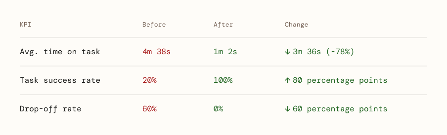
Post implementation, I retested the user flows with the same 5 participants, having every metric moved in the right direction.

Impact results table — before and after metrics
1m 2s

Avg. Time on Task

↓ 78% vs before
100%

Task Success Rate

↑ 80pp vs before
0%

Drop-off Rate

↓ 60pp vs before
The Reflection

What I'd do Differently

This project taught me valuable insights into payment UX while also highlighting the relationship between timeline pressure and maintaining research integrity.